Why a Responsive Website is Essential for Your Business
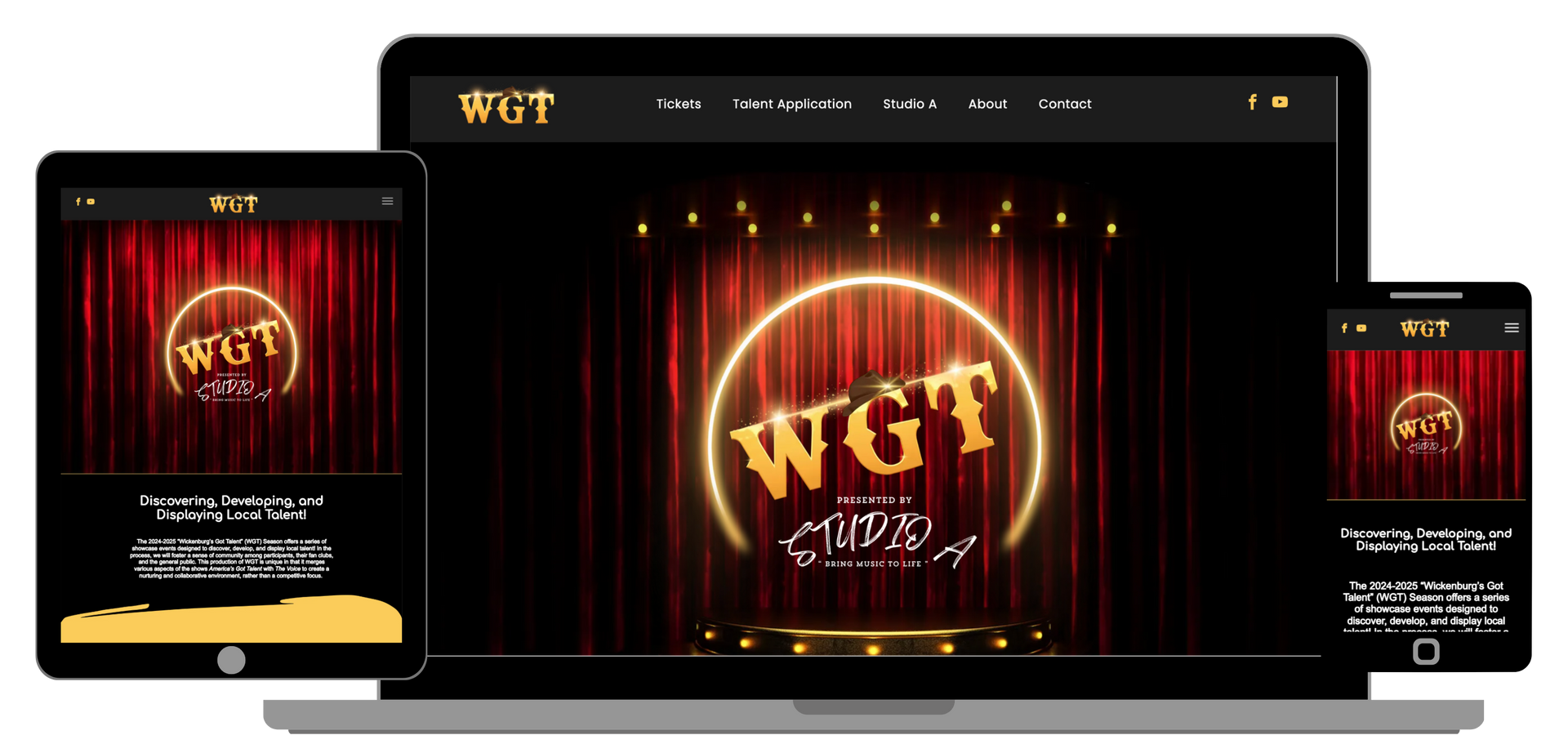
In today’s digital age, simply having a website isn’t enough. You need a
responsive website to ensure you're providing the best experience for your visitors—no matter what device they’re using. But what exactly does "responsive" mean, and why is it so important?
What is a Responsive Website?
A
responsive website is one that automatically adjusts its layout and content based on the screen size and device being used. Whether someone is visiting your site from a mobile phone, tablet, or desktop computer, a responsive design ensures the best viewing experience. This means no more zooming in or awkwardly scrolling sideways to view your content.
If you're running a business, this is especially crucial. Imagine a potential client trying to access your site from their phone and getting frustrated because the layout isn’t mobile-friendly. That's a missed opportunity. With a responsive design, you're ensuring visitors always have a seamless, user-friendly experience, no matter how they’re browsing.

Why Does It Matter?
- Mobile Traffic is Growing
Did you know that mobile browsing now accounts for more than half of all web traffic? This means that if your website isn’t optimized for mobile devices, you could be losing a lot of potential customers. At The Site For Sites, we focus on making sure your site looks just as good on a mobile device as it does on a desktop. - Improved User Experience
Your website is often the first impression customers will have of your business, and they want to have a smooth experience. If users have to pinch and zoom just to read text or navigate, they’ll likely leave quickly. A responsive site automatically adjusts to the device, ensuring users stay engaged and can easily find what they’re looking for. - Better SEO
Google loves responsive websites. In fact, the search engine giant recommends responsive design for mobile optimization. A site that’s mobile-friendly and well-optimized will perform better in search results, driving more traffic your way. At The Site For Sites, we take SEO seriously to help ensure your website ranks higher, which ultimately brings more visibility and potential customers. - Fewer Maintenance Issues
Without responsive design, you would need a separate mobile version of your site. This requires ongoing updates and can be a hassle to manage. With a responsive website, you only need to maintain one version, saving you time and resources. - Stay Ahead of the Competition
In a competitive digital world, being ahead of the curve can make all the difference. A responsive site isn’t just about looking good on different devices—it’s about showing your visitors that you care. When your site works seamlessly on mobile, it signals to users that you're a modern, reliable business.

What Should You Look for in a Responsive Website?
When designing or evaluating your website, here are a few things to keep in mind:
- Fast Load Times: A slow site is a surefire way to lose visitors. Ensure your images and other elements are optimized for quick loading.
- Easy Navigation: Whether visitors are on a mobile or desktop device, your navigation should be intuitive and simple to use.
- Consistent Branding: Your site should reflect your brand’s personality across all devices. This means making sure your logo, colors, and fonts stay consistent and easy to read, no matter the screen size.
- Flexible Media: Videos, images, and other media should resize properly without losing quality when viewed on different devices.
In Conclusion
A responsive website isn’t just a nice-to-have feature anymore—it’s a necessity. It improves user experience, enhances SEO, and helps you stay competitive in a mobile-first world. At
The Site For Sites, we prioritize responsiveness across all devices. We understand that your website needs to look great and function smoothly whether it’s accessed on a mobile phone, tablet, or desktop. That’s why we make sure every site we build is fully responsive and optimized for any screen size.
If you're unsure how to get started or want to ensure your website is fully optimized for all devices, feel free to reach out. We specialize in creating responsive websites that work seamlessly across all devices, making sure your site’s performance is top-notch across platforms. No pressure, just a conversation about how we can help you grow your business online.
As we discussed in our previous blog, "How Local Businesses in Wickenburg Can Benefit from a Professional Website," having a professional, responsive website can make all the difference for local businesses looking to grow their presence and attract more customers. If you're ready to take the next step in building your business's online presence, The Site For Sites is here to help!


